Know what I’m salty about?
In all my art classes, I was never taught HOW to use the various tools of art.
Like yes, form, and shape and space and color theory and figure drawing is important, but so is KNOWING what different tools do.
I’m 29 and I JUST learned this past month that India Ink is fucking waterproof when it dries. Why is this important? Because I can line something in India Ink and then go over it with watercolors. And that has CHANGED the ENTIRE way I art and the ease I can create with.
tldr: Art Teachers: teach your students what different tools do. PLEASE.
WAIT INDIA INK JS WATERPROOF ONCE IT DRIES????? THE ENTIRE REASON IVE AVOIDED MARKERS MY ENTIRE LIFE IS BECAUSE JNK BLEEDS AND YOURE TELLING ME INDIA INK IS
F U C K I N G W A T E R P R O O F
yall calligraphers out there this is extremely fuckin important if u wanna get into illumination shenanigans because i swear to you there will b discoveries like these^
heres some of mine, pls take with a grain of salt im a total gotdamn amateur:
- a lot of the time, the ability for colored ink to bleed will vary wildly WITHIN A SINGLE BRAND OF COLORED INKS. my cobalts bleed like fucking CRAZY compared to my reds, which, when u reference manuscripts that tend to put white ink ON TOP of either red or blue… you see where shit gets real and real annoying.
- u can buy an aeresol, fully transparent workable sealant for like 5-10 dollars at your local art store. when i realize a piece ive been working on needs a color on TOP of a bleed happy ink, i give it a layer of this stuff. trouble is it CAN warp the paper so its important as soon as it dries to use heavy things (paperweights, books) to counteract the paper curling.
- ink solvent, like koh i noor’s rapido-eeze, is only compatible with SOME inks, but will work on most acrylics. If you happen to be working with sturdy vellum that you have pre-sealed, it can be possible to literally use ink solvent to wipe away your calligraphy mistake like a goddamn bounty commercial
Shit I Learned Working At Dick Blick:
- WD40, found at your local hardware store, will remove Sharpie marker from almost any hard surface.
- Acrylic inks will show brush strokes in large areas but are waterproof and quick-drying.
- Acrylic gouache is vivid, fluid, dried matte, is UTTERLY opaque on black paper, handles exactly like watercolor, and is waterproof.
- Putting an oil painting in the sun will turn the yellowed portions back to their original white and wont hurt the painting.
- Cheap acrylic paintings will bleach out if left in the sun – get UV protectant spray or varnish. Nicer acrylic paints are less prone to sun bleaching, but they still do. Plan accordingly. Oil paints are much less prone to this.
- Solvent-based markers blend together MUSH MORE SMOOTHLY than alcohol-based markers.
- There is an acrylic paint medium for literally every effect you can conceivably think of (fabric paint medium, gloss medium, fluid medium, sand medium, fast-dying/slow-drying medium, etc.).
- If you’re going to buy student-grade paint to save cash, buy earth-tones (burnt sienna, ochre, etc.); they are made with cheap pigments already, and you wont tell a difference. You WILL tell a difference between student-grade and artist-grade bright colors (all yellows, blues, and reds).
- If you’re working with markers but aren’t using marker paper, you need to switch. Markers don’t blend on printer paper, they just layer (even expensive markers).
- If you want a glass palette for paint mixing but don’t want to shell out the cash, buy a giant picture frame at Goodwill, take the glass out, and electrical tape it to a piece of foam board the same size for stability.
- Hog bristle brushes are for oil paint, sable brushes are for watercolor, and synthetic brushes are for acrylic and oil (but not watercolor because synthetic bristles can’t absorb water).
- If you’re going to splurge on any aspect of your creation, splurge on the paper. Get the good stuff – crappy markers/paint/pencils look good on good paper, but not the other way around.
(There is more, but these are the big ticket items)
Some more, also from working at Dick Blick:
– Palette knives are for mixing paint and TRUST ME you want to learn how to use them. When you mix with your brush you loose paint and it’s hard in your brushes.
– DO NOT FIX YOUR ARTWORK WITH HAIRSPRAY. If you’re proud of your work and want to keep it, buy the actual spray fix. Hairspray is not archival in the slightest and will damage your work.
– On top of that, be careful how you store your work. Newsprint is handy and cheap, but also not acid-free and it will yellow your paper. Foamboard? Matboard? Also not always acid-free (but you can get them acid-free).
– There is no food-safe paint. Period. There are lots of ways you can decorate pottery that aren’t glazes, but only glazes are food safe (and even some of those aren’t).
– Also not food safe: Polymer clay (sculpey), air dry clay, oil-based clay, ceramics that have not been glaze fired, oil pastels, sharpie, glues of any kind, or mod podge (even the ‘dishwasher safe’ kind).
– Don’t even get me started on mod podge. It’s not consistent. It’s not archival. It’s not a sealant, it’s a glue (setting aside some of the weird hyper-specific ones they make that I’ve literally never seen in real life).
– If your glue isn’t archival or at least acid-free, don’t use it in your artwork.
– There are so many different kinds of paper out there, just go try them. But also make sure you know if it’s acid-free or not (it probably is).
– Marker paper is usually 15 to 20 lbs. News print is usually 30 to 35 lbs. Tracing paper is usually 25 lbs. Rice paper can range from 20 to 50 lbs. Printer paper is 20 lbs. Vellum paper is usually 48 to 55 lbs. Sketchbook paper is usually 50 to 60 lbs. Drawing paper is usually 70 to 80 lbs. Cardstock can range from 50 to 110 lbs. Charcoal paper is usually 50 to 65 lbs. Pastel paper can range from 70 lbs to board. Bristol paper can range from 50 lbs to board. Mixed media paper can range from 90 to 140 lbs. Printmaking paper can range from lbs 90 to 300 lbs. Watercolor paper can range from 90 to 500 lbs.
– The heavier and rougher the paper is, the more it will absorb. If you’re using a paper too smooth for your medium it will take forever to dry and may smudge. If you’re using a paper too light for your medium, it will warp and curl.
– If you’re working heavily with water, you need to stretch your paper (aka seal down your edges of the paper to a hard, water resistant surface). If you don’t like doing that because it’s a hassle, buy a watercolor block instead of a pad/individual peices.
– If you’re working on a thicker paper, and make a mistake that your can’t erase or cover- you can scrape and/or cut it out! With a really sharp exacto knife, you can very CAREFULLY remove the top layer of paper fibers on most paper.
– DO NOT USE ACRYLIC AS BODY PAINT. It’s plastic.
– If you paint with oil, buy a silicoil jar. It’s the best $10 you’ve ever spent.
– Acrylic paint is basically water-based plastic. It will basically fuse with anything plastic (like a plastic palette), and will not stick to anything oil-based.
– Acrylic paint and house paint are not the same thing and you cannot mix them together. Acrylic paint is made from a water-based acrylic polymer, and house paint is almost always latex and can come both water-soluable and not.
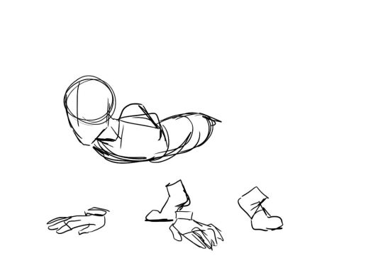
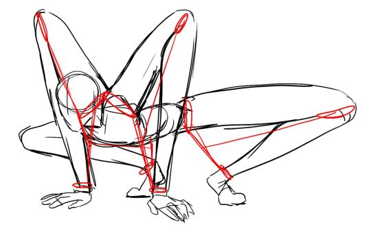
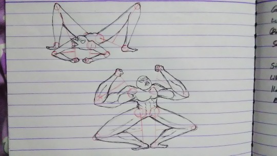
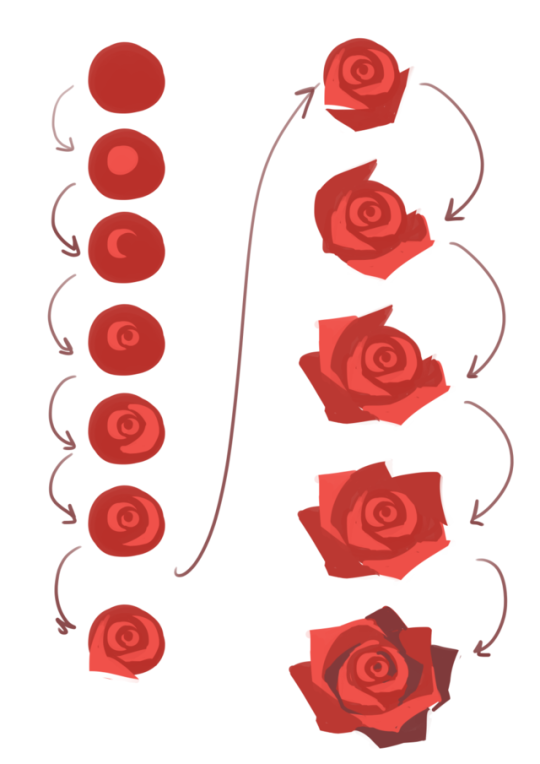
@pamelab has this amazing reference crossed your dash yet?
On that last note about the acrylic and house paint: my sister, once she noticed that, took advantage of the effects she got when it dried from her process and changed her entire Art Final to use that technique